Tuesday 28 January 2014
Magazine Photoshop Tutorial
Firstly I learnt that you have to get the right length and the right width for a magazine cover- this will make it more realistic. Also with the right width and length you would be able to fit in all the key conventions for the magazine. Then you select the background and then you can choose what colour you want. Also You could also add extra effects to the magazines cover (Spotlight in the centre) the way this is done to select the first layer and click on the brush and choose how thick you want it. Then you click on the 'T' to add add all the text you want and you have to have separate layers for text in different areas. If you want to add images then you have to open a new tab and you download the file and convert to a Jpeg and insert to the magazine cover. If you want make any image bigger you have to click on the different layer which is very complicated but you do get used to it. As I used Photoshop last year and got the hang of it. If you want to change the colour of any text you have to click on the text layer if you change your mind at the end of the process. If you want to delete the layer- you have to double click on the layer and click on the bin sign on the bottom left. If you want to add any slogan you have to click on the TEXT that's how you add another layer and you could change the font type by clicking on the tab on the top of the bar.
Monday 27 January 2014
Magazine Front cover analysis

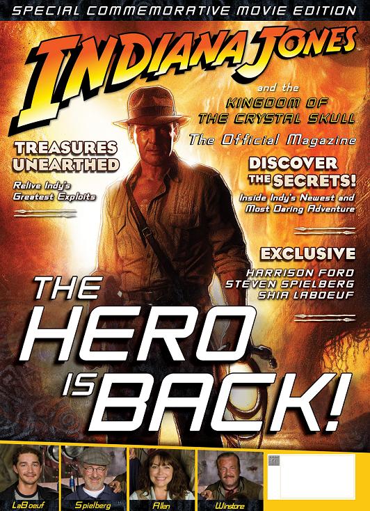
1. Title of publication- The title is placed in the top third because it is easily visible and it stands out as its a BBC production and that's why the logo is in the top third. The title of this magazine is really bold but isn't taking up all the top third as people will recognize doctor who because of the BBC slogan in the top third and the actors- this is why the title isn't taking up the top third as it's a recognized brand. When we see the BBC logo we can trust it and this could lead to more sales as the consumers can trust it and trust all the information inside the magazine. The connotations of the silver colour are Mysterious and emotional and Doctor who has both of these including in the doctor Who story- mysterious adventure and emotional love life. The colours also go with the SCI-FI genre silver and gold and we see these colours on Star wars etc. When we see these colours we usually reefer to sci-fi movies and that is why these colours are used.
2. Slogan- In the top third we can see the slogan from BBC which reads 'celebrating 50 years of adventure in space and time' This shows how consistent BBC- producing a TV consistently for 50 years and its still going strong and it is something special and that is why the slogan is in the top third because they want the people to see what BBC have archived and it is something to brag about. We usually see slogans right on the top- but this is slightly different as its just on top of the title, or we see the slogan under the title. The
3. Central Image- The central image used on this magazine is the doctor of the show- Matt Smith. With most magazines we see- we only see the one 'anchor man' the main person of the show. With this magazine its completely different as we see 3 actors compared to the one used on most magazine front covers. BBC don't really need to establish the main values of doctor who as its been around for 50 years and the consumers tend to know everything about the show. Also Matt Smith can attract other types of audiences as he's been in other projects- this something that BBC and the Publishers are keen on using the main actor to gain more viewers. That is why the focus is on him and the other 2 are blurred out as they want the attention on Matt Smith. Matt Smith does establish the core value of this as its about doctor who and it isn't better central image than using the main actor. The type of shot used on Matt Smith is a medium close so we the audience can focus on his face, eyes and body language. The way the doctor is addressing the audience is by the serious look which is a common look with doctors and its exactly the look Matt Smith is giving to the audience. With the central image we can't see any females, which may connote that doctor who isn't really aimed at the female audience- the priority are the males. The reason why BBC prioritize the male audience is because they can go out and buy the merchandise which isn't really aimed at females.
5. Free offer- This magazine convention is used with this magazine. You get free anniversary cards with this edition. When we see this magazines you eyes go straight on that side of the page as its in bold red which connotes emergency, importance and the audience eyes go straight on the red text. The text stands out from other texts on the page as its bold and red
6. Colour scheme- The colour scheme on this magazine is very limited and not many colours are used with this magazine. This is because BBC don't want any piece of text to get mixed up. The colour coordination is very dull- the colours used: Red, white, gold and black. These colours aren't the lightest. Black is the magazines background as doctor who's main colour is black. The white text is used for the slogan as white is the main colour for text on a magazine. The Red colour is used on the competition text as that is the colour that gets most people attention. gold is used in the competition area as gold is the colour for winners.
7. Name checks- Name checks is used by making the audience feel that everyone, the audience, are together. They use it by the celebration slogan in the top third. This makes the audience feel that they are enjoying the success together as its a massive achievement and the consumers want to take part in the success.
8. Language- We can see that no words are wasted in the front cover and BBC are straight to the point with this. The language used is alliteration which makes the consumers remember the slogan as its catchy and it will be repetitive in their minds and this helps the T V show promotion and its very small and effective.
9. Competition- In the modern day magazines competition is on of the main connotion on a magazines as it attracts many people with the prices that could be won. The use of competition with this magazine is that you could win official merchandise such as DVDs. Many doctor who audiences will be interested in this as they will have the series highlights on DVD which they can view again. The clever thing is the suspense that BBC have built up as it says nothing on how you could win these prices
10- Bar code, date and price- With this magazine the bar code is on the bottom of the page and this is with most magazines as industries don't want consumers to be put of with prices so it is in the smallest font possible.
11. The real target audience- The real target audience for this magazine are the people who are interested in doctor who and for the people who watch doctor who. All these competitions and free gifts are used to create brand loyalty meaning that BBC are loyal to its customers and they reward them. Lastly the target audience could be the fans of Matt Smith as he is the main character and it could attract his fans.


Sunday 26 January 2014
Ill manors review
Ill manors is directed By Plan B- Ben drew. This isn't the only project that Ben drew has directed, he's also made a short movie which included Adam Deacon. Also he's directed a music video. Ill manors was the first major thing that he has directed and it was a massive success and the movie had such a low budget and still produced a masterclass. In my opinion the director was fantastic and produced a masterclass with sun low budget and we can say that this movie was successful because it made a profit and this was down to Ben drew as he done the right things to produce Ill manors.To sum up Ben Drew we can say he produced a film which will interest everybody in England as its about life in the raw areas which people would be interested in.
The actors in the movie aren't really well known and we haven't see them before as Plan B had a very low budget so he had to get less know actors. The only actor i recognized was Aaron (Riz Ahmed) the others I didn't know off. The other actors where: Ed skrein, Natalie press, Nick Sagar and many more. Also we saw a cameo from Plan b in the Taxi. I think getting these unknown actors is fantastic for the narrative as majority of the actors are brought up in the rough environment and the actors used suited the plot very well and it was great from plan b to do this as these actors weren't just in the movie for financial reasons- which made the movie better. Most of these actors have been in smaller movies but we haven't seen them in massive budget movies but they have appeared in movies.
Ill Manors is about Drugs, violence and prostitution. There are 4 characters who consume drugs and sell drugs in London streets. It's also about abuse of Women and how the females can be a source of money as we see ED walking around the streets and trying to sell a women to the shop owners as ED needed the money. Also it shows what prostitution can do- Women are more vulnerable as we see the females in Ill manors being thrown around and doing anything for money and drugs. Also all Drug dealers and Prostitutes are brought up in raw estates and families with one mother and broken families or in care homes, and this means they haven't been taught values of life and left to do anything at the earliest age.
The movie genre is crime thriller and the mood off the movie is scary and darkened and this is how some parts of London are. Also the mood of the movie is very depressing and whilst watching the movie we don't expect what going to happen next as most things in the movie where unbelievable. In this movie there are very scary situations where the audience can't watch at some times as the situations is very strange- and there is always high amounts of tensions. Also suspense being created throughout the movie. This movie is an 18, but many people below the age rating watch this movie as 15-17 years can relate to many characters in this movie. 16-30 is the target audience for this movie. In this movie there are many characters that are below 18 years old. The most important situation in this movie was done by a 15-16 year old, when he killed Kirby.
I think the soundtracks for this movie related to the plot. As all the songs where about the movie. Most of the songs where by Plan B and he was raping about the narrative, which is almost like a voice over. The genre of the music is grime as grime relates to the movie.
This movie is aimed at 16-30 years as most of the characters from ill manors age is between these ages. The physchographics for this movie are reformers because This is due tot he fact they are looking to change not only themselves but the society around them.
Saturday 25 January 2014
Ill Manors Film trailer.
- What are the typical codes and conventions of film trailers - what information is usually provided?
- How are trailers distributed?
- How does Ill Manors use trailer conventions?
- Who is the target audience? Does it have a unique selling point or use particular techniques to appeal to the audience? Consider the way the scenes are edited together – does the trailer give away any clues about the narrative? Are the main stars visible in the trailer? Is there information about the director of the film? Is there information about the release date? Is a narrator’s voice-over used?
- How has the genre of the film been represented through characters, settings, lighting, colour, music/dialogue, camera shots/movements/angles and editing?
1) In the ill manors trailers we see many trailer codes and conventions. Firstly we see the production companies at the start of the trailer. Then we see quotations from magazines throughout the trailer. We see the main actors in the trailer. In the trailer we also see the location. Also the trailers usually have a soundtrack or a narrator telling the narrative.
2) Trailers are usually distributed on: T.V, Radio or cinema screens and internet. Same movie distributors advertise on each other cinema show.
3) The characters are introduced and it builds suspense as we see the characters in serious situations, but we don't know why they're in that situation- which builds suspense. Then we see the location being introduced when we see a birds eye view shot of east London and tracking shot on the motorway. The title of the movie is shown in bold large text. We see quotations from magazines and newspapers which could attract more viewers who read the magazines or newspapers. Lastly in the ill manors trailer we see the production companies.
4) The primary target audience for this move are people aged around 16-30 adults and teenagers. It could also attract people who live in east London as the movie is set in East London. Also it could attract plan B's fans as they like his music and they would want to see a movie produced by him. The USP for ill manors is two main selling points which are mentioned above. Firstly the location which isn't used in movies and the Plan b the fans as they would want to hear the music in the movie and this would make them watch the movie.
5) The setting is very dull and boring and its a very scary environment as its full of drug dealers and raw estates. Which are quite close to city as we can tell because the flats aren't really developed and when you get closer to the city the housing is worse and we see more flats. The genre is presented as very boring and very intimidating as that't how some parts of east London are and its presented very realistically.
Ill Manors: the making of
1) What does this tell us about Plan B's intentions in making the film?
We learn that Plan B wants to tell people that he isn't just a pop star who's had it all free in life, so he wanted to direct a film- which was successful. Also He wanted to show how life is in East London- where he lived as a child. He wanted to show his fan base, Working class urban teenager who live in the big cities, that he just doesn't make music- he is multi-talented and can create a movie. Also the media present East London like the Olympic capital, sporting greatness, But Plan B shows the opposite of east London: Violence, drugs and prostitution. Lastly Plan B wanted to show how he grew up and how life was in East London. Also London is presented like the best place ever and its safe and secure, This movie shows how dangerous London can be, as we see in the movie when Kirby gets shot. Also Plan B wanted to direct this movie himself and wanted to do it himself and had his own vision.
2) What do we learn about the production process for Ill Manors?
We learn that the production process had a very low budget, but the low budget mad this movie more realistic as we didn't see well known actors and this movie was set in estates and high streets which brought the narrative alive as the movie is about life in east London- getting these unknown actors who have been in these situations brought it alive and was very successful. Also we learn how realistic the production process is. If it was a multi million pound movie, Ill manors isn't,we wouldn't see a scene in the crack house it would be in a studio on the green screen. With Ill manors we see them go into a crack house which was a great piece of production. Lastly we hear Riz Ahmed saying that they couldn't film in a location because it was a drug dealers 'turf' so they had to change location.
3) What can you tell about the possible target audience from this short documentary?
The psychographics group that may watch this could be reformers.This is due tot he fact they are looking to change not only themselves but the society around them.when We first see the movie we believe that the target audience are just teenagers. The primary target audience are teenagers who are in the same situation. Then we see a interesting piece from Edward saying that this movie isn't just for the people who are thugs- who took part in the riots. It's also aimed at the opposite meaning how these people are brought up and why they come into these situations which is absolutely true.
4) Does the film successfully do what director Ben Drew (Plan B) set out to achieve? Explain your answer with reference to both the film and the making of documentary.
In my opinion Plan B does successfully achieve what set out to do. The movie is about: Drugs, violence and prostitution and he wanted to present this in a movie and he wanted to how the raw parts of London are. He did get the message across with this movie to show people how London is. He used the right location (east London estates) right actors who been brought up in the same environment lastly the right houses (crack house). He wanted to show how life is in the other parts of London as in the media we don't see them mentioned and Plan B wanted to show everyone how life is being a drug dealer or being around drug dealers.
Tuesday 21 January 2014
Shot list
Shot List
Producer:
|
Production:
|
Shot No.
|
Shot Type
|
Details of Shot
|
Timing
|
1
|
Establishing shot
|
shot of the estate
|
0.02
|
2
|
High angle shot
|
of the roads cars driving past
|
0.03
|
3
|
Close up of the estate door
|
of the estate doors
|
0.02
|
4
|
low angle establishing shot
|
introducing the main character.
|
0.01
|
5
|
tracking shot- camera going up
|
showing what the main character is wearing and how he looks.
|
0.03
|
6
|
over the shoulder shot
|
The character walking towards the block
|
0.01
|
7
|
wide shot from the side
|
heading towards the block
|
0.01
|
8
|
close up tracking shot
|
camera moves around his head looking worried.
|
0.03
|
9
|
high angle shot
|
his hand going to his pocket
|
0.02
|
10
|
camera low below hip
|
taking his phone out of his pocket.
|
0,02
|
11
|
Close up
|
of the time on his phone
|
0.01
|
12
|
extreme close up
|
reaction of his face looking scared
|
0.02
|
13
|
over the shoulder
|
of the character approaching the stairs.
|
0.02
|
14
|
Close up
|
again looking at the reaction of his face.
|
0.01
|
15
|
wide shot of inside the block in front of the doors.
|
This shot we see him opening the door.
|
0.02
|
16
|
High angle shot from the top of the stairs
|
this shot shows how worried he is.
|
0.03
|
17
|
low angle shot from the bottom of the stairs.
|
Stepping up the stairs slowly
|
0.02
|
18
|
side wide shot
|
walking up the stairs
|
0.02
|
19
|
over the shoulder shot
|
walking up the stairs
|
0.03
|
20
|
close up
| showing the face of the main actors face |
0.03
|
21
|
Tracking shot
|
Main actor pulling his zip up
|
0.03
|
22
|
Close up
|
pulling up his hood
|
0.01
|
23
|
over the shoulder shot
|
walking down the hallway
|
0.02
|
24
|
side tracking shot
|
walking down the hallway
|
0.03
|
25
|
wide shot
|
coming to the edge of the hallway
|
0.02
|
26
|
establishing shot
|
introducing the other actor
|
0.02
|
27
|
over the shoulder
|
from the worried actors point of view
|
0.03
|
28
|
over the shoulder
|
from the one standing waiting
|
0.02
|
29
|
wide shot
|
when they bump into each other
|
0.02
|
30
|
high angle shot from the point of view
|
The other one falls down
|
0.03
|
31
|
Long shot
|
Of him running away
|
0.02
|
32
|
close up
|
The older person putting his hood up
|
0.03
|
33
|
medium shot
|
of him walking away
|
0.02
|
34
|
tracking shot
|
the man walking down
|
0.03
|
35
|
close up
|
looking left and right looking worried
|
0.03
|
36
|
long shot
|
The man turning around and is up for a bang as he gets pushed to the floor
|
0.04
|
37
|
low angle shot
|
2 men in black masks running towards the man
|
0.03
|
38
|
High angle shot
|
two men beating him up
|
0.05
|
39
|
medium shot
|
the 2 men taking the bag
|
0.03
|
40
|
long shot from the edge
|
the 2 men running away with the bag
|
0.04
|
41
|
High angle shot
|
Andre helpless and hurt
|
0.03
|
42
|
wide shot
|
Andre getting up
|
0.03
|
43
|
wide shot
|
His hand going to the pocket
|
0.02
|
44
|
close up of the phone
|
this shot we see his wife
|
0.02
|
45
|
close up
|
Andre crying
|
0.03
|
46
|
close up of the phone
|
dialling 999
|
0.02
|
47
|
extreme close up
|
him on the phone
|
0.03
|
48
|
close up
|
him turning around and getting punched and the phone drops
|
0.03
|
49
|
Black out
|
black out
|
0.03
|
50
|
over the shoulder shot
|
approaching someone leaning over a balcony
|
0.03
|
51
|
over the shoulder from Rashaun
|
Andre Saying "yo"
|
0.02
|
52
| over the shoulder from Andre | Rashaun saying "What you got for me" | 0.02 |
53
|
over the shoulder from Rashaun
|
Andre saying "nothing fam just came to chat to you quick. I want out I cant deal with this no more.
|
0.03
|
54
|
over the shoulder from andre
|
*Laughing* why you moving shook?
All right you have to do one more big favour for me thoe then you can cut .
|
0.03
|
55
|
over the shoulder from rashaun
|
ANDRE
Say nothing last one yh
|
0.02
|
56
|
close up tracking
|
Andre walking away
|
0.03
|
57
|
below hip shot
|
Rashaun taking out his phone
|
0.02
|
58
|
close up of the phone
|
Rashaun calling someone
|
0.02
|
59
|
close up
|
RASHUAN get on the phone and commands some one to beat up ANDRE and get the drugs of him so ANDRE could be in his debt for a long time.
|
0.03
|
60
|
wide shot
|
Rashaun putting the phone down
|
0.04
|
| Black out | Black out | 0.03 |
Tuesday 14 January 2014
Progress report
Individual progress: I've completed all the individual research for the coursework. Also for the group I completed the mis- en- scene: casting details etc.
WWW: With the research and planning I completed all the tasks that had to be done and they were all on time. With the group research and planning I done the work I was set by the group- which has lead me on to do the storyboard.
EBI: I need to complete the storyboard and i completed half of the storyboard but I need to finish it by Thursday.
What I need to do next is completing the second half of the storyboard for Thursdays lesson.
As a group we are doing well as we done the script in great detail and we done all the research.
What we have to do know is finish the shot list so we can get filming. We hope to finish the shot list by the end of the week.
Monday 6 January 2014
Mis En Scene for our teen drama
Location Settings
Our teen drama is focused on West London youth- so we wanted an area which represents London youth. There are many locations that came to mine whilst taking ideas. We wanted to do it in a estate as that's the main connotation of Gang violence etc.
One of the location was racecourse which is in Northolt. This estate isn't as raw and dangerous as other Estates In London. This is an option because is spacious and represents the London Image: Brick flats, balcony and warning signs everywhere. Also pole lights all around the area. From watching this teen drama the audience will know that it is London as there is the Ealing Logo. This estate has connotations of a Raw estate that is why is an option.
 .
.
The second Location was Grand Union Village. This is a massive estate (village) with over a thousand flats and houses. This choice is being considered as the main option as there are many areas where we can film. This area represents all types of families in England. One mothers, young mothers and normal families. This could be strong contender for the location as its a typical estate in London. This village is very diverse all types of people live in Grand Union Village. Also in Grand Union Village there is high amounts of violence.

Lastly the Location which came to mind was Golf Links. This is one of the most dangerous and most violent estate in London. Throughout the years it has calmed down from violence and has been developed. The estate has massive tower of flats and is a common image in London. The tower of flats usually be in Violence teen drama's e.g. Kidulthood and Adulthood. As you see in the image its very dull. This shows the whole place is very depressing and people don't enjoy to live in that estate.

Other concepts of mis-en-scene
The Teen Drama is going to be filmed at night. This is because we don't see violence mid day or in the morning. So as a group we opted to go for the night. The costumes in our teen drama would be what gangsters usually where- Hoodies, tracksuits and gloves. These types of clothes intimidate people in the U.K and represent gangsters, so its a key concept in our teen drama.
Overall this is how gangsters are represented in the United Kingdom. Usually living/hanging out in Estates. The intimidating clothing.
Cast:
The villain (struggles against the hero)- Andre
The donor (prepares the hero or helps the hero)- Alieu
The hero [AKA victim/seeker/paladin/winner, reacts to the donor, weds the princess- Rashaun The princess (person the hero marries, often sought for during the narrative)- Andre's girlfriend
Our teen drama is focused on West London youth- so we wanted an area which represents London youth. There are many locations that came to mine whilst taking ideas. We wanted to do it in a estate as that's the main connotation of Gang violence etc.
One of the location was racecourse which is in Northolt. This estate isn't as raw and dangerous as other Estates In London. This is an option because is spacious and represents the London Image: Brick flats, balcony and warning signs everywhere. Also pole lights all around the area. From watching this teen drama the audience will know that it is London as there is the Ealing Logo. This estate has connotations of a Raw estate that is why is an option.
.The second Location was Grand Union Village. This is a massive estate (village) with over a thousand flats and houses. This choice is being considered as the main option as there are many areas where we can film. This area represents all types of families in England. One mothers, young mothers and normal families. This could be strong contender for the location as its a typical estate in London. This village is very diverse all types of people live in Grand Union Village. Also in Grand Union Village there is high amounts of violence.
Lastly the Location which came to mind was Golf Links. This is one of the most dangerous and most violent estate in London. Throughout the years it has calmed down from violence and has been developed. The estate has massive tower of flats and is a common image in London. The tower of flats usually be in Violence teen drama's e.g. Kidulthood and Adulthood. As you see in the image its very dull. This shows the whole place is very depressing and people don't enjoy to live in that estate.
Other concepts of mis-en-scene
The Teen Drama is going to be filmed at night. This is because we don't see violence mid day or in the morning. So as a group we opted to go for the night. The costumes in our teen drama would be what gangsters usually where- Hoodies, tracksuits and gloves. These types of clothes intimidate people in the U.K and represent gangsters, so its a key concept in our teen drama.
Overall this is how gangsters are represented in the United Kingdom. Usually living/hanging out in Estates. The intimidating clothing.
Cast:
The villain (struggles against the hero)- Andre
The donor (prepares the hero or helps the hero)- Alieu
The hero [AKA victim/seeker/paladin/winner, reacts to the donor, weds the princess- Rashaun The princess (person the hero marries, often sought for during the narrative)- Andre's girlfriend
Exam Feedback
1) What three things will you do differently in the February mock exam as a result of your feedback? Explain in detail - imagine you are giving yourself advice in the build-up to the next Media exam you have.
1)Structure my work into different paragraphs (3-4)
2) More Language revision
3) Need to take much more detailed notes so my answers are more detailed.
2) What grade are you aiming for in the February mock exam? Justify your answer.
The Grade I'll be aiming for in The February Mock is a C. This is because my answers were not detailed- if I add more paragraphs the grade will improve. Also I'm more experienced with Note taking, so in the exam I will be ready for the questions and my points will be backed up. With the video shown I will go more in depth and explain the small things.
3) What grade are you realistically aiming to achieve in this exam component in May? Justify your answer.
The grade that I want in the summer is a high C. This is because I want archive a high grade in AS Media. The high C is very achievable as in May I will be more experienced and I will have a better knowledge of everything: Theory's and language. Lastly I think is very realistic to get a C because I know where I made my mistake and These mistakes will not be done again.
WWW: Some good attempts to use media language and question 4 contains some good points.
EBI: Your written English is a problem- there is no organisation to your points so you answers are not clear. \re-read question 1 for an example You've also got key media language wrong which means you need to revise. More detailed note are required.
Subscribe to:
Posts (Atom)